
Why Color Psychology Matters in Bathroom Design
Color doesn’t just look nice—it actually affects how you feel. When you’re stepping into your bathroom first thing in the morning or winding down before bed, the walls around you are sending signals to your brain. Soft blues and greens activate your parasympathetic nervous system, which is your body’s relaxation mode. Warm neutrals like taupe and cream create a sense of grounding without feeling cold or sterile.
We’re not talking about painting your entire bathroom one flat color. The trick is layering—using a primary calming tone for your walls, then introducing secondary colors through fixtures, textiles, and natural materials. This creates depth and prevents the space from feeling boring or institutional.
The Foundation: Choosing Your Primary Palette
Start with walls. Your wall color sets the mood for everything else. You’ll want something that feels calm but doesn’t look washed out in natural light. Here’s what actually works:
Soft Greens
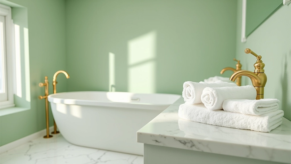
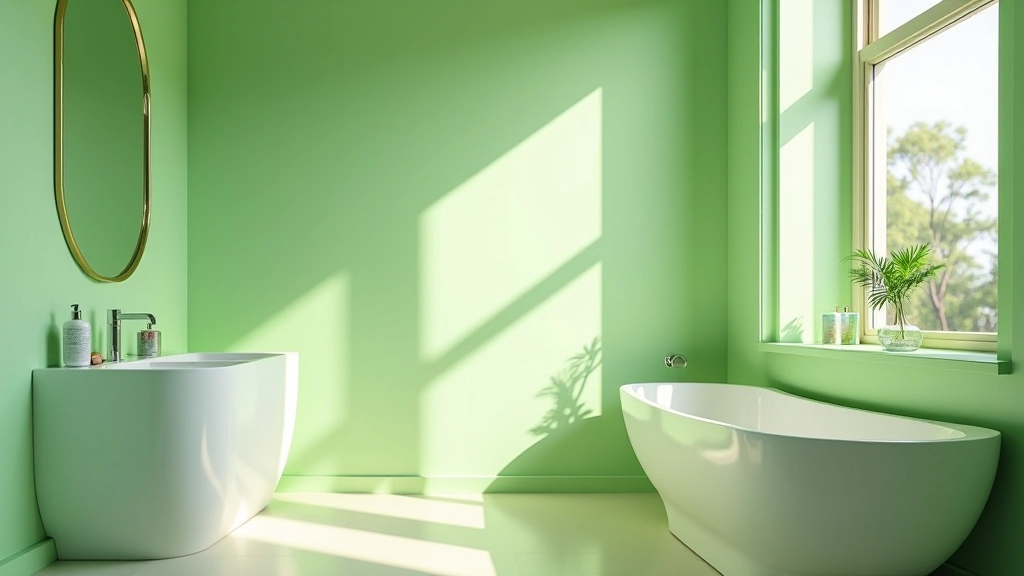
Think muted sage, celadon, or pale pistachio. These connect to nature and promote genuine relaxation. They’re especially good if your bathroom gets decent natural light.
Warm Grays
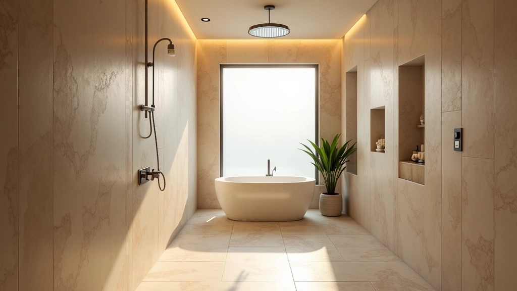
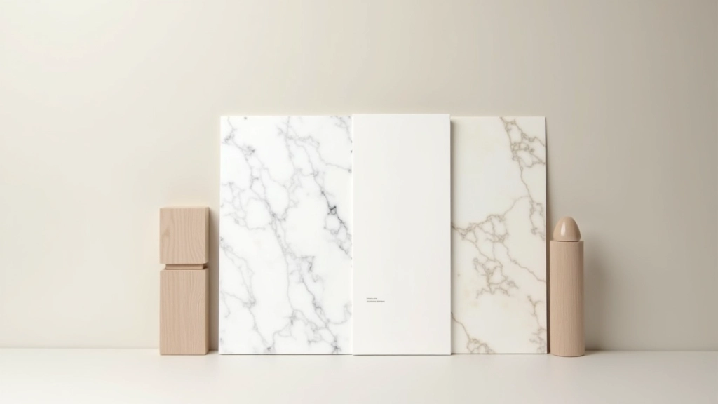
Greige (gray + beige blend) or warm taupe feel sophisticated without being sterile. They pair beautifully with marble and natural stone, which most spa bathrooms feature.
Soft Blues
Pale blue-gray or dusty periwinkle evoke water without screaming “beach house.” They’re calming and work in almost any lighting condition.
Creamy Whites
Not stark white—we’re talking off-white, ivory, or warm white. These maximize light and create an airy feeling while staying genuinely relaxing.
Layering Secondary Colors for Depth
Your primary wall color is just the beginning. We layer in secondary colors through cabinetry, accents, and accessories. If you’ve chosen soft sage walls, you might add warm gray vanity cabinetry, then bring in cream-colored towels and natural wood shelving. This creates visual interest without feeling chaotic.
The 60-30-10 rule works beautifully here. Your primary color (walls) takes up about 60% of the visual space. Secondary colors (vanity, larger fixtures) account for roughly 30%. Accent colors (plants, small decor items, artwork) fill the remaining 10%. It’s not a rigid formula—it’s a guide that prevents color overload.
Pro tip: Don’t overlook ceiling color. Painting your ceiling a shade lighter than your walls creates an airy, spa-like feeling. It literally makes the space feel larger while maintaining that cohesive calm aesthetic.
Practical Color Combinations That Work
We’ve tested these combinations in actual Repulse Bay homes, and they consistently deliver that luxurious-yet-calming feeling:
The Classic Retreat
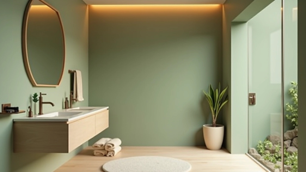
Soft sage walls + cream cabinetry + warm gray accents. Add marble or light travertine tile. Introduces nature without feeling trendy. This combination stays beautiful for years.
Modern Serenity
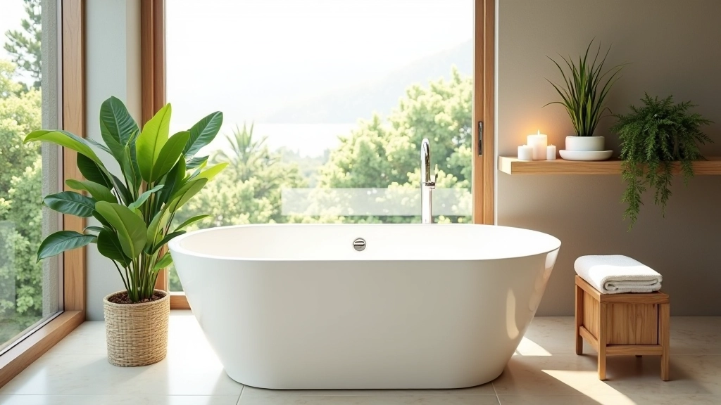
Pale blue-gray walls + white cabinetry + natural wood shelving. Very clean, very calming. Works particularly well with minimal, contemporary fixtures and sleek lighting.
Warm Elegance
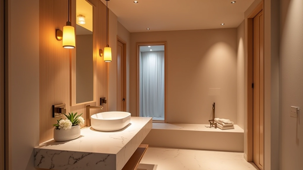
Warm white walls + warm gray vanity + brass or brushed gold fixtures. Layer in warmer stone (cream limestone or honey travertine). Feels luxurious and inviting, especially with adequate lighting.
Soft Monochrome
Multiple shades of gray (light, medium, darker) with white accents. Sophisticated and incredibly soothing. Works in any lighting situation and accommodates various fixture styles.
Making Your Choice Work in Your Space
Here’s where most people stumble. They choose a beautiful color but don’t account for their specific bathroom’s lighting. North-facing bathrooms need warmer colors—soft whites with peachy undertones instead of cool grays. South-facing spaces can handle cooler tones beautifully. East and west-facing bathrooms are actually the easiest because light is relatively balanced throughout the day.
Before committing, get paint samples and live with them for at least three days. Look at them at different times—morning light, afternoon light, evening with artificial lighting on. Colors shift dramatically depending on light temperature and angle. You’re not just looking at the paint; you’re experiencing how it’ll make you feel when you’re actually in that space.
If you’re renting or hesitant about permanent changes, remember that color layering through removable elements works too. Bathroom vanity paint is semi-permanent and relatively affordable to change. Towels, bath mats, and accessories can introduce secondary colors risk-free. Even a potted plant or two shifts the entire feel toward that spa aesthetic.
Creating Your Personal Spa Retreat
The most luxurious bathrooms aren’t the ones with the most expensive fixtures—they’re the ones where you actually want to spend time. Color is how you create that feeling. By choosing calming primary tones, layering in complementary secondary colors, and accounting for your space’s unique lighting, you’re not just redecorating. You’re designing an experience that supports genuine relaxation and self-care.
Start with your walls. Move to your cabinetry and fixtures. Layer in textiles and accessories. Step back and notice how the space makes you feel. That’s when you’ll know you’ve gotten it right. And honestly, once you experience your bathroom as a real spa retreat rather than just a functional room, you’ll wonder why you didn’t do it sooner.